Monday, April 26, 2010


"As for Fraleigh’s work, perhaps I’ve seen too much painting but this stuff is straight out of early 70’s Fem painting, with too many practitioners to mention (Joan Semmel), some doing it well and some not. Seems there’s always a problem when trying to combine different tacks that you don’t go far enough with ether. I’d like to see the abstract or the figurative elements pushed further, made tougher. There are analogies between the forms of the poured paint and body shapes and functions but why not geometric abstraction too, or some othre body parts besides the face? "

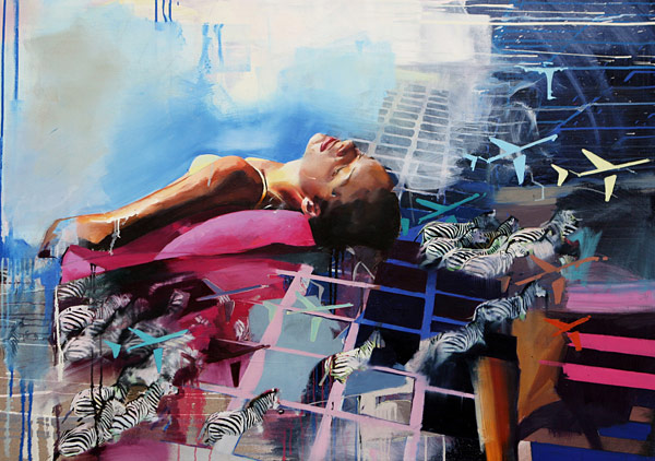
None of the suggested artists i could locate on the NYC blog, so I went with the artist Angela Fraleigh, a painter that explores the same clashing of realms and paint handling. Above is a critique posted on the blog about Fraleigh's work. I find the words that state "the problem with trying to combine different tacks is that you don't go far enough with either. This rings very true to my work as well as hers. The constant need to combine abstract and figurative work leaves me with a huge equation that usually ends up disastrous.

"I don't think a figure awash in a wilderness of paint is sustainable as a career.
Unless that paint is exquisite.
Is it?"

This comment also serves as a delivering blow of what i knew was inevitable. A very true statement and i dont even do enough action painting in the background and i believe she starts with he figure work and then splashes copious amounts of paint on the canvas and then moves it around in a therapeutic fashion that distorts what portions of the figure remain visible. to the contrary i paint the painterly and abstract layer as my prepped background and then slap the figures on the surface in some plane defying manner that leaves them flat and separated from the space, which I enjoy the frustration and awkwardness to that space but people must beg for more. I feel if i had all the time in the world to pursue this problem i could get both facets to a very legible state. right now i am falling very short...

Friday, April 16, 2010


My god i suck at what i do and found someone that does it wayyyy better. introduction, this is an irish artist by the name of Chloe Early, damn she's got bars!!!

Tuesday, April 13, 2010

I chose to focus on mainly Michael Borremans. His figures are slaves to the space they inhibit. some of these figures are merely busts, they begin above the waist almost stuck in concrete. the compositional perspective is precise and believable yet obtrusive and discomforting which i love! again I need to focus on the lighting of my figures and shadows... shadows are a hugh issue when it comes to my work, I usually use shitty photographic resources and the shadows need to be created themselves. Borremans also uses really believable color palette that reads as both realistic yet aged and nostalgic. If I could incorporate his placement of figure in awkward spaces and emerging from planes into the abstract and turbulent atmosphere I create, I believe my intentions may be more apparent.
Matthew Greene employs a similar paint application technique to that of mine. The many layered backgrounds the interact with the forms create a movement that I long to achieve. I need to push my figures into theses spaces rather than plop them directly on the surface. I wish i had the guts to paint with very opaque whites and leave them that way. His saturation is toned down so much it evokes and erie sickly aura. negative space also plays a key role in his work, I tend to fall off the deep end when it comes to expressing hypergraphia. i clutter my spaces when simplicity should be just as driving as the overall idea itself. I want to achieve something similar to that of Greene's disappearing methods, where the forms wash into the background color.

Monday, April 12, 2010

contemporary glance

Tim Gardner portrays figures in their personal space. his pieces are very literal and seem like they are painted directly from photographs of friends. I do enjoy the facial expression and the correlation to their surroundings. In another of his works there is a horizontal figure immersed in a sea of bear bottles. The vulnerability is definitely present.
Atul Dodiya paints roll top doors int he streets of india as well as canvas and paper works. He deals with the same space and figure relationship and evokes emotional response. sometimes literal and sometimes rather metaphorical, Dodiya produces very charged works and can access the viewer almost immediately. This is something I have been struggling with recently. How do I clearly present my issue and have it be abstract and legible at the same time? I enjoy Dodiya's use of complementary hues.


"I attempt to create an atmosphere outside time, a space where time has been cancelled."
-Michael Borremans


immediately i am drawn to Borremans content. the anchoring of his figures and the metaphor of this ambiguous space and the figures relation to that space intrigues me. he has a loose but very representational stroke. He works in oil watercolor and ink which, for the most part, resembles my three key mediums. i really appreciate his clear definition of this made up space. i lack imperative boundary and plane distinction. I need to decipher more clearly between the imaginary and the actuality.


Matthew Greene Builds beautiful atmospheric perspective in his work. The washes and layering in the background is far more effective than my own. the conversation between the forms and figures to that of the awkward space is rather beautiful in all it's jumbled fragmented mess. I really need to work on leaving pieces unfinished. the way his figures drop back int0 the space and disappear flippantly is very indicative of a vulnerability and loss within oneself. the layers signify this facade idea i have juggled. I need to loosen up, i need to not be constrained by the initial canvas prep, it should have no effect on what comes next!!!