


...but thats the idea right?
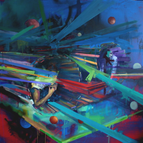
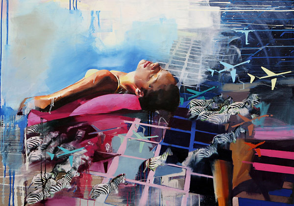
Bold? is it bold to fail? I made some decisions to break away from a formula that obviously wasn't working. Last minute additions to my pieces proved somewhat risky, throwing a Haefling face down in the paint on the last day could have ruined the little I actually had going on. In that piece in particular I adhered too much to the photoshopped collage of images I had compiled. I started off with my formulaic background and then said screw it, I cant stand the lack of conversation between the acrylic action painting and the oil figurative work. I need to stop this shit. This was extremely hard because I had become so comfortable with something and to push it away was liberating but also putting me in the dark. Now where do I go??
I still used safe routes in the next piece, employing the use of a distinctly different language in the background, incorporating blueprints that literally lent to the idea of facade and our building up of walls to keep folk out. I personally found this piece more successful than the previous work but at the same time it wasn't enough, not in the visual sense but in the painterly sense. I chose an illustrative escape on this one, outlining some forms which I cant stress enough is like cheating. something about showing something for crit that is obviously unfinished drives me nuts, so i tend to make moves last second that actually hinder the integrity of the work as a whole far more than the unfinished areas.
I know I want to work with the figure in relationship to a more abstract idea and literal paint application, but currently my stuff looks like just any figure painting, in the portrait (which I wish I didnt have to call it that) it does read too much as a self portrait. this was completely unintentional, at the same time, we are our best models. I keep thinking I can use myself as reference and then render my features differently, I cant stray far enough from the image at hand. This proves a huge roadblock in my work.
I still wish I could work on 18 foot walls, If i had the opportunity to just paint on the studio walls I think I would enjoy that much more, Id have the opportunity to break away from some of the safe routes I take in terms of paint application and formula. The scale would force me to work quicker and with larger brushes. I hate working a foot away from my paintings cramped in the corner of my bedroom. the size would demand much better rendering on my part and proper proportions would be key. One day...
sometimes... flat, muddy, erie, dark, boring, ethereal, true, moist, cold, confusing,
approach... careful, contemplative, sure, at times unsure, visceral, comfortable, forced, timid, quick, tame.... ugghhhhhh
I work too fast in relation to my idea, my idea demands more clear portrayal at the same time if I continue working at the speed I do, maybe just a shit load more paint would take it to that point, the one that makes it look like I know what I am doing.
We all employ defense mechanism to keep ourselves in these little boxes. we may present ourselves in a carefree manner but we all have our secrets, our cover-ups. so...here i go again with this facade word. we all have them where is our essence why is society such a huge impact on our appearance, our expression of emotion, our relationships with others? Even in the application or production of Paintings or art in general, far too many folk are directly referencing society and common culture...why is this?? why can't we reach a point where we are creating something new. as hard as I try my work looks just like the next guys, though these days I feel I at least reference a more classic or formal approach...too bad this is frowned upon.
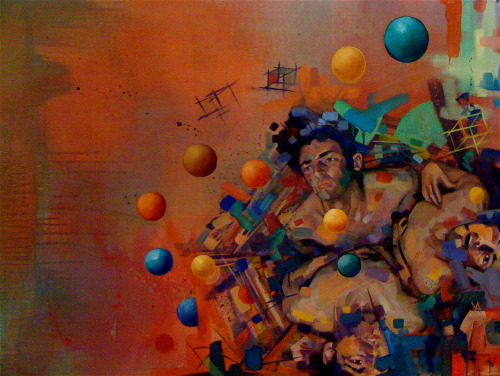
Currently I have been leaning toward the deconstruction of plane, shape, and color. I am super intrigued by the Leipzig painters, incorporating the flat yet form taking planes with my figurative work seems like it could be new something refreshing and helpful to expressing my intentions. David Schnell to name the one most influential in relation to where I see myself going with the abstraction and deconstruction of things. this guy kills it, knocks it out the box...
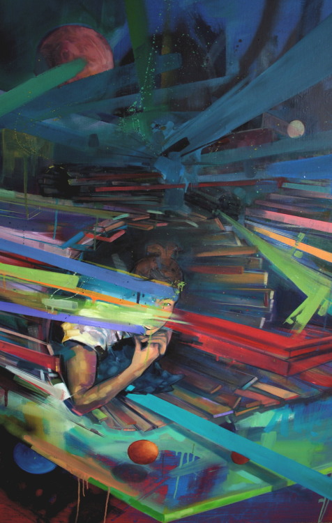
With the very last piece I finally started experimenting, employing Richter techniques with a squeegee, though hesitant to use a bunch of pigment, I got a feel for the general application process and potential moments that could occur. I didnt take it far enough, and the plane breakdown I experimented with the boats never made it to the level I had anticipated, but I believe I am on the right track, I just need to stop being so fucking scared and paint. simple. paint. The figure in that piece does get closer to the level Id like to achieve, and I am actually somewhat pleased with that. On the other hand I need to work with more than one figure, with a larger scale and play with the shadows and lighting far more. blahhh
current events??? I dont care for this war bullshit, theres no way my work could ever pull troops out of iraq or take away planes from the towers, I cant go back in time and prevent ethnocide to the natives or stop global warming single handedly. I can evoke a feeling inside oneself that may prove true to many, that we are inside ourselves, we are all far too abstract in how we present ourselves. timelessness, introversion, hidden emotions, lies, the act of preventing oneself from opening up to someone else or inviting people in is something that will never end. It is also something that we see as a huge trigger in war and relations between countries and cultures as a whole. The age old "don't judge a book by it's cover" is disregarded every day by entities larger than ourselves. We cannot communicate nor do we understand these bodies of people elsewhere so we interject for our own righteous selfish reasons, because we think we have a solution. no solution comes from one direction, it is the melding of it all that produces answers. if only the ice caps melting covered everyone in paint...


 I chose to focus on mainly Michael Borremans. His figures are slaves to the space they inhibit. some of these figures are merely busts, they begin above the waist almost stuck in concrete. the compositional perspective is precise and believable yet obtrusive and discomforting which i love! again I need to focus on the lighting of my figures and shadows... shadows are a hugh issue when it comes to my work, I usually use shitty photographic resources and the shadows need to be created themselves. Borremans also uses really believable color palette that reads as both realistic yet aged and nostalgic. If I could incorporate his placement of figure in awkward spaces and emerging from planes into the abstract and turbulent atmosphere I create, I believe my intentions may be more apparent.
.jpg) Matthew Greene employs a similar paint application technique to that of mine. The many layered backgrounds the interact with the forms create a movement that I long to achieve. I need to push my figures into theses spaces rather than plop them directly on the surface. I wish i had the guts to paint with very opaque whites and leave them that way. His saturation is toned down so much it evokes and erie sickly aura. negative space also plays a key role in his work, I tend to fall off the deep end when it comes to expressing hypergraphia. i clutter my spaces when simplicity should be just as driving as the overall idea itself. I want to achieve something similar to that of Greene's disappearing methods, where the forms wash into the background color.
Matthew Greene employs a similar paint application technique to that of mine. The many layered backgrounds the interact with the forms create a movement that I long to achieve. I need to push my figures into theses spaces rather than plop them directly on the surface. I wish i had the guts to paint with very opaque whites and leave them that way. His saturation is toned down so much it evokes and erie sickly aura. negative space also plays a key role in his work, I tend to fall off the deep end when it comes to expressing hypergraphia. i clutter my spaces when simplicity should be just as driving as the overall idea itself. I want to achieve something similar to that of Greene's disappearing methods, where the forms wash into the background color.
 Tim Gardner portrays figures in their personal space. his pieces are very literal and seem like they are painted directly from photographs of friends. I do enjoy the facial expression and the correlation to their surroundings. In another of his works there is a horizontal figure immersed in a sea of bear bottles. The vulnerability is definitely present.
+Atul+Dodiya-1.jpg) Atul Dodiya paints roll top doors int he streets of india as well as canvas and paper works. He deals with the same space and figure relationship and evokes emotional response. sometimes literal and sometimes rather metaphorical, Dodiya produces very charged works and can access the viewer almost immediately. This is something I have been struggling with recently. How do I clearly present my issue and have it be abstract and legible at the same time? I enjoy Dodiya's use of complementary hues.
Atul Dodiya paints roll top doors int he streets of india as well as canvas and paper works. He deals with the same space and figure relationship and evokes emotional response. sometimes literal and sometimes rather metaphorical, Dodiya produces very charged works and can access the viewer almost immediately. This is something I have been struggling with recently. How do I clearly present my issue and have it be abstract and legible at the same time? I enjoy Dodiya's use of complementary hues.


 finally achieving some sort of depth, working past the flatness and pushing figures back in space. This proves rather difficult since I am working from a flash Polaroid photograph with real poor form definition. mostly guess work.
 Sean Cheetham another contemporary oil painter that wrestles with figure and space
 letting it flow
 first color after underpainting, kind of garbage
 bleach out
 Canvas prep
 Hung Liu Has inspired my work. The way in which she applies the paint in a very drippy manner and yet still achieves detail and form is rather fascinating.Her subject matter almost always incorporates figure and a made up space.
 I know there is a point in which we must stray from the mainstream uber famous artists like Klimt but there is a part of me that will never let go of his work. That and I am also influenced by Egon Schiele who was mentored by Klimt. Again the focus on the figure and the interaction with a made up space is very key.
 David Choe's work has a lot of the same elements as mine. layering is rather apparent and shape scribbling often adorns his background. something about lines that aren't too straight or too rendered gets me going.
 Gail introduced me to Zak Smith. His work is similar and influential to mine in that he works from photos of friends and images he has taken. Because he leaves the figures black and white, the background acts more as a design and intricate shape work than just the documentation of their space.

 Some of my studies frustrated me, I used the same methods of production for all of them, spending what now seems like far too long on the initial pencil sketches that drive the washes. Towards the end the washes became more transparent and far less layered.
  The initial idea behind the thirty studies we have been working on in studio has evolved as I progressed through the series. As I started the series I originally intended to deal with human emotion and the spacial relation to the figures and how surroundings can evoke different emotion and connotation. I was initially searching for vulnerability, but as I have moved forward the idea of personality as a defense mechanism drove my ideas. Who are these people, what is the importance of their settings? how are their physical expressions and placement perceived? all the photos I work from are my own. The subjects are friends or myself. I know these people and I know when their guards are up. It is quite lovely to be able to capture those vulnerable or fraudulent moments in expression. I love experiencing the moments in which the people I am close to are lost in thought, sad, depressed, stressed, anxious, secretive, inquisitive, angry, tough, weak.... the list continues. I also found that my organic nature in producing these layered abstract backgrounds really lends a whole other dimension to my idea. their emotions are suspended in an intangible world of thought and writing, shapes, math, vectors. there is so much happening around them and yet they are still. I like to think the floating words and shapes are the very items that depict the subject's thought, their aura.


